
Ideal sizes for images
- Default Profile Cover Image – default 7:2 aspect ratio. This has now been standardized to use the same aspect ratio for mobile/desktop for easier maintenance of images
- Default Event Image – default 16:9 aspect ratio. Common resolutions in the 16:9 ratio are 1920 x 1080 pixels and 1280 x 720 pixels
- Default Resource Image – default 16:9 aspect ratio. Common resolutions in the 16:9 ratio are 1920 1080 pixels and 1280 720 pixels
- Default Marketplace Image – default 16:9 aspect ratio. Common resolutions in the 16:9 ratio are 1920 1080 pixels and 1280 720 pixels
- Default Membership Image – recommended 1:1 aspect ratio (square). This has no fixed dimension at the moment, it will display the whole image
- Top Menu Bar – Top navigation bar has a fixed height of 52p across devices, however width does depend on the width of the device’s screen. We recommend a size of 2560 x 52 pixels to accommodate widescreen monitors.
- Cover Image for Space – You can add cover image for any Space. Cover images are responsive and we recommend this size to start: 2000 x 420 pixels
The 16:9 aspect ratio is widely used across many popular platforms for images and videos due to its versatile and visually appealing dimensions. Here are some of the platforms that commonly use the 16:9 aspect ratio:
- YouTube: The default aspect ratio for YouTube videos is 16:9. Any other ratio will have padding added to fit the 16:9 frame.
- Facebook: For shared images and cover photos, Facebook supports the 16:9 aspect ratio. This ensures that images and videos display optimally across various devices.
- Twitter: Twitter uses the 16:9 aspect ratio for single image posts, making it a standard format for sharing media on this platform.
- LinkedIn: On LinkedIn, shared image posts also frequently use a 16:9 ratio, especially for content intended to appear well across different screen sizes.
- Digital Photography and Websites: The 16:9 ratio is also prevalent in photography and web design, particularly for landscape images and hero banners on websites. It’s favored for its cinematic feel and ability to convey a broad context or story.
This aspect ratio's popularity stems from its ability to fit well on modern displays, including widescreen monitors, HDTVs, and mobile devices, making it a versatile choice for both creators and viewers.
Sign Up & Log In images
The images on the Sign Up and Log In views are designed to be responsive, and so they are not going to guarantee the exact aspect ratio. That is, they will resize based on your Screen Size and your Browser Window Size, in order to support all different kinds of users on all different kinds of devices. With that been said, we recommend 1720 x 2160 for optimal display.
To see this for yourself, please head to the Sign Up / Log In screen for your ScaleGrowth solution while logged out – or in a different browser / incognito window. Then grab the bottom right corner of your browser window, and try resizing it, both horizontally and vertically.
Notice how the image will truncate depending on the space available. This is by design. We could stretch the image instead, but it would look incredibly ugly – imagine all the people and objects in the photo being unnaturally stretched or squished in either dimension. We could shrink the image to fit the space available, but then you will have ugly empty space either above & below or on the left & right depending on the Screen Size / Browser Window Size the user uses.
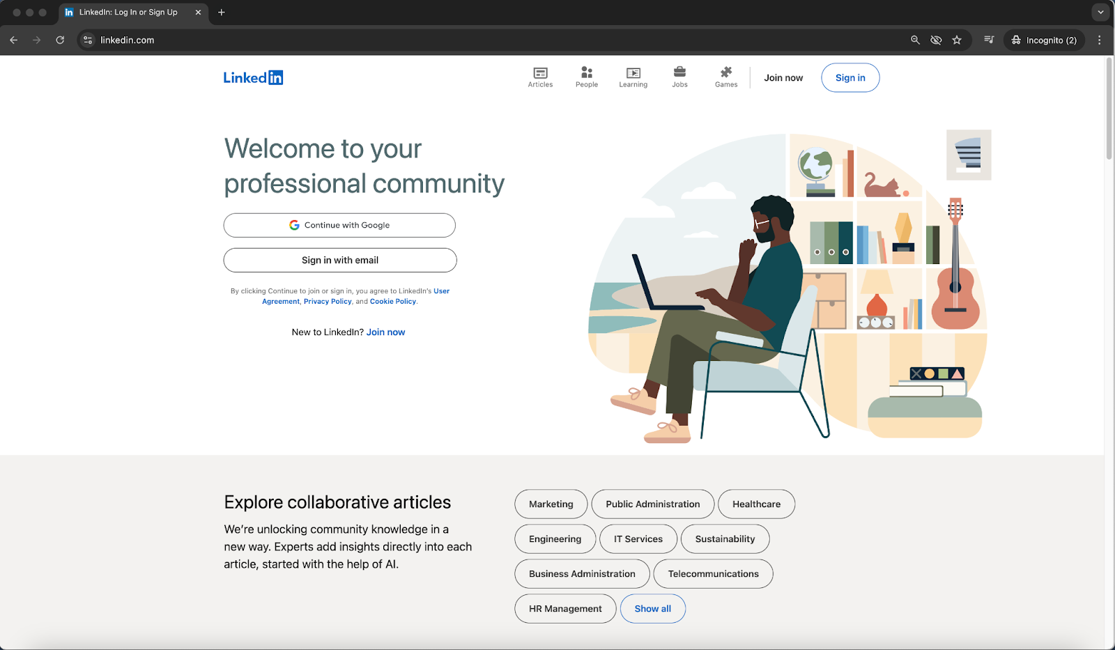
So, instead, we use this responsive approach – this is a common best practice for these kinds of images. Here is an example of LinkedIn doing the same exact thing, so we are in a good company:
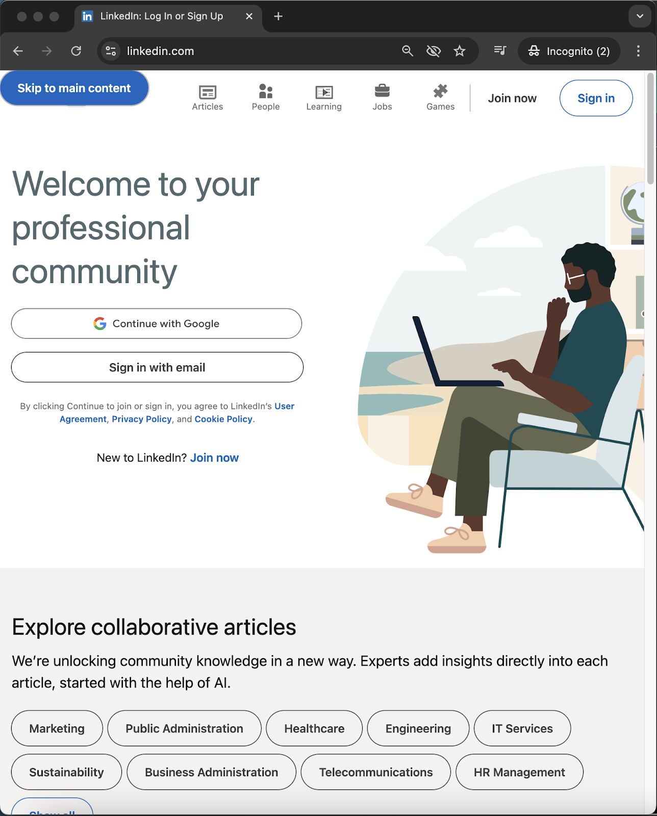
So, we recommend choosing images where you don't mind the cropping based on the user's Screen Size & Browser Window Size for Sign Up and Log In views.
Customizing Aspect Ratios
Finally, if you prefer to use a different aspect ratio for any of your images, you can achieve this with Custom CSS if you have someone on your team who understands CSS. Please see Custom UI Look & Feel Using CSS to learn more.
If you do not have anyone who understands CSS on your team, our Professional Services team offers a service to customize the look & feel to your designs & specifications. Please submit a request in your Success Center if you are interested in exploring this.
